


BACKGROUND
Vinyl Dreams is a record store in my neighborhood that specializes in all different types of dance music including house, techno, and disco. It's a place where the community gathers to buy records, attend shows, or even just hang out and talk to staff.
PROBLEM
Vinyl Dreams has no web presence, alienating them from potential customers and decreasing their profit margin.
SOLUTION
Create an e-commerce site that allows both targeted and browsing users to purchase vinyl and browse for community events easily and efficiently.

What can we learn from our competitors?


MAIN TAKEAWAYS


-
Larger distributors generally display new releases on the home page.
-
Smaller labels and shops all display an "about us" section.
-
Larger distributors include sample audio clips.
-
Large/Impactful Imagery of the record
What can we learn from our users?
I conducted in-depth interviews with 10 individuals, every person I interviewed had purchased vinyl online within the past year and 9/10 people were vinyl dreams customers. I used the affinity mapping method to define key insights from these interviews.


Turning research insights into design solutions
After discovering some key user insights from my user interviews, I sat down with a pencil and paper and wrote down as many potential design solutions to each insight as I could.
These are a few of the key design solutions I came up with in response to discoveries from market research and user interviews along with the final design solution used in the prototype.
Insight: "Genres are the most important classifier in my shopping process"
Solution: Design a menu that will allow users to see all different genres available at a glance and click into them, as well as a standalone page with listed genres.

Multipe Insights related to sales and deals
-
Discounts and deals play an important role in my purchase
-
I subscribe to newsletters to find out about sales and deals.
-
62% of online shoppers think it’s important for an e-commerce website to have sections for specially priced items.

Solution: make the sale section a part of the main navigation and include and include a CTA to join the mailing list that will increase overall traffic to the site and improve retention.
Insight: "I care about the owner and employees and want to support local businesses"
Solution: Include a "about us" section shown prominently on the home page that allows users to make a personal connection with the staff wihout having to physically visit the store.

Insight: "The aesthetics of vinyl are important
to me"
Solution: Design a product listing page to include large imagery of the vinyl records with multiple high-quality product shots.

Creating an Information architecture for quick and easy browsing
I created a sitemap that would dictate how products were grouped on my site by key insight "genre is the most important classification" I followed market standards and vinyl dreams existing genre classifications. This would serve as the skeleton for my design ideations.

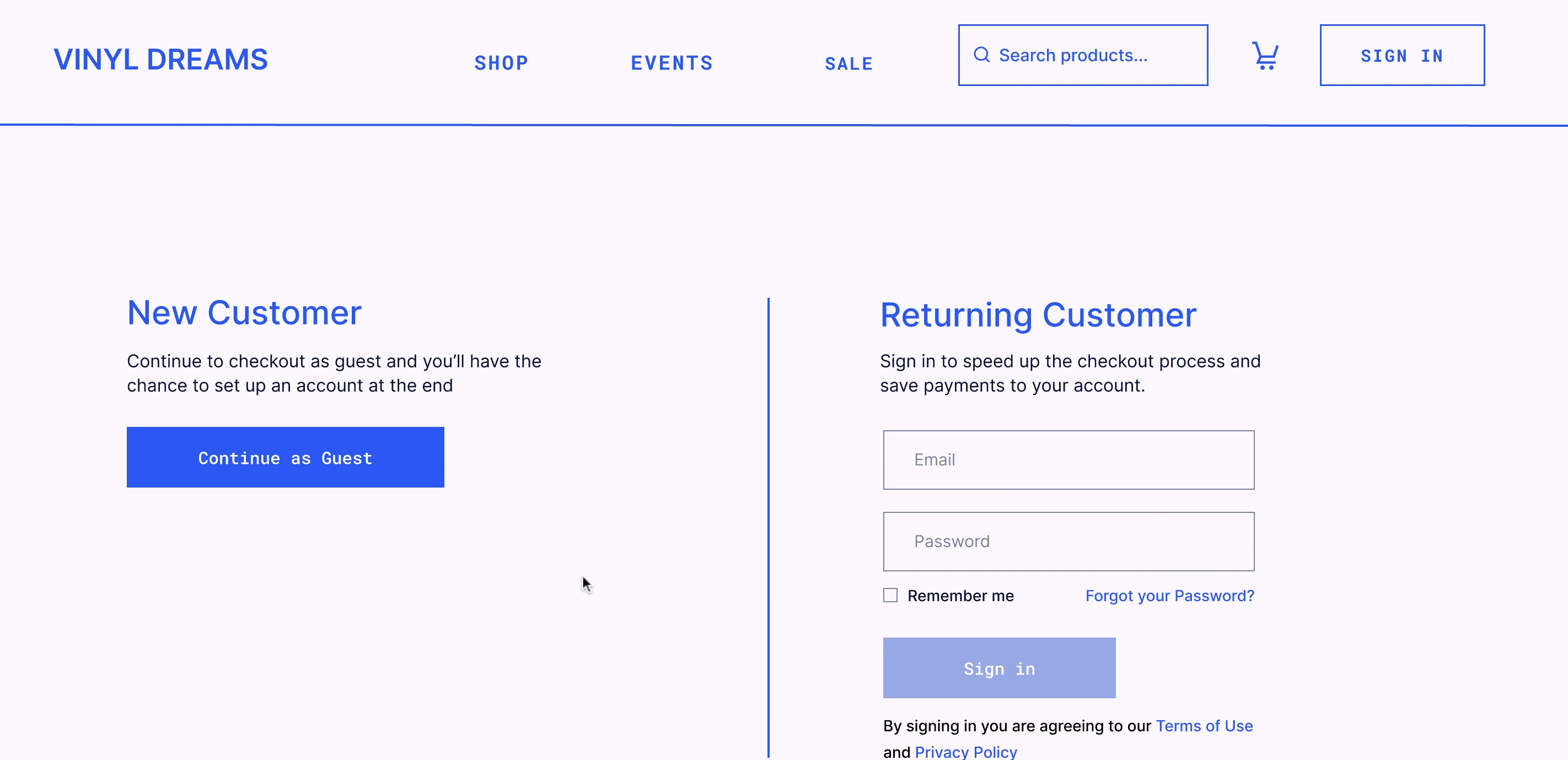
Designing a checkout flow for conversion
Vinyl record sales have been exponentially growing since 2005, and have reached an all-time high (record sales are now even higher than they were in 1975). This validated the business need for an e-commerce site to meet the needs of a growing market.
To help understand market standards and best practices, I conducted a competitive analysis between direct and indirect competitors to Vinyl Dreams. Observing 12 e-commerce sites in total, I looked at businesses ranging from large international distributors to local record labels and record stores.
E-commerce cart abandonment rates average close to 70%-wich means that designing this part of the site was very important for the Vinyl dreams business goals.
Below I will break the design decisions made to the payment flow, in direct response to some of the top reasons for carts are abandoned (study 2022, Baynard Institute, 4,384 responses).

User Pain Point: Extra costs too high & Delivery was too slow
Solution : Offer multiple options for shipping, and show the calculation of extra costs as early as possible (after the shipping address is entered).

User Pain Point: Forced to create an account to finish check out
Solution : Allow users to check out as a guest, offer account creation after user has finished payment.

User Pain Point: too long, complicated check out process.
Design a step by step checkout flow that allows the user to see each step on one page.

A look into building out the mobile solution
Sales on mobile devices have steadily been increasing since 2018 and continue to make up a larger percentage of overall e-commerce sales- It was important to create a easily navigabnle mobile solution for this site. Below I will call out some design descisions I made to work within the constrains of a smaller screen size.

Less horizontal real estate for mega menu
Since a narrow screen did not allow for multiple columns of copy, I created a drill-down menu that allows user to click into
different categories and see longer lists of items in a vertical scroll.

Easily move from mobile device to desktop
Over 61% of mobile users use their desktops to finish purchases.
Making sure the "save to cart" button was easily accessible to reduce the overall number of cart abandonments. I made the "add to cart" and "buy now" buttons fixed to the bottom of the product page so the user would always be able to click on them.

Listed Items & Images accessible behind
vertical scroll
Trying to cram all of the items from certain categories onto the page would have created a lot of scrolling for the user and also make it impossible to see other categories at a glance. To negate this, I made Items accessible through a horizontal scroll- leaving more vertical real estate available on the page.
I made product imagery available through scrolling as well- this way it wouldn't take up an entire page view and users could still have context for what they were looking at since there was enough room for the product title and description on the page.

Creating a visual language as fun as the shop itself
I created a simple yet bold, bright impactful aesthetic for the site.
STYLE SHEET
2C58F2
HEADER HK GROTESK BOLD 24PX
Subheader HK Grotesk 21px
FCF8FF

Image treatment: Luminosity
with blue background
Button Text Roboto Mono 16px
Body: HK Grotesk Regular 16px.
Sed ut perspiciatis unde omnis iste natus error sit voluptatem accusantium doloremque laudantium, totam rem aperiam, eaque ipsa quae ab illo inventore veritatis et quasi architecto beatae .
Deliver

Impact
These results were measured 1 month after the site went live. I measured sales averages against the monthly average from the previous year.
62%
Increase in sales
50%
Increase in newsletter
supscriptions
4%
increase in average order value
62%
Increase in sales
Lessons Learned+Next Steps
This project helped me understand that the needs of the stakeholder can be just as important as the needs of the user and that it is important to keep both in mind when creating design solutions. Creating the checkout flow was a perfect example of this- the needs of the (something quick/ easy and efficient that allowed them to track their progress) aligned with the needs of the business- making the process as painless as possible for the user so that they wouldn't abandon their carts.
Next Steps to Measure Impact:
-
Continue to Monitor sales (specifically sales made through online purchases) to asses how the addition of the website affected business and what the overall ROI is.
-
Use analytics tools to measure drop-off rates on key screens (specifically on checkout flow) to measure its overall effectiveness.
-
Measure customer satisfaction through